

5.5 Deep Dive: Analytics and Reporting

The Analytics menu allows you to create customizable dashboards with charts and tables that track activity across Opstream. This is where you can visualize your spend, request activity, approval times and pipeline metrics.
You can:
-
Use pre-built dashboards for common procurement metrics.
-
Build your own dashboards to track legal, security, or operational KPIs.
-
Filter and arrange data so you see exactly what’s important to your role.
-
Dashboard Layout – choose between Grid View (widgets arranged in a grid) or Horizontal View (widgets lined up across the page).
-
Sharing Dashboards – share your customized dashboard with other users in your organization so teams can work from the same view.
Example use cases:
-
Procurement: track vendor spend and contract savings.
-
Legal: monitor the number of contracts under review.
-
Security: follow the progress of security questionnaire completions.
-
Operations: track workflow completion times across departments.

Related Video: How to use Analytics Customizable Dashboards
5.5.1 How to Add a Widget
To add a chart or table:
-
Click the big + “Add Widget” button.
-
Choose from the available Tables or Charts.
-
Add filters (e.g., by department, vendor, request type).
-
The widget is added to your dashboard.
5.5.2 Using Tables
-
Requests Table - Mirrors the Requests main view.
-
Vendors Table - Mirrors the Vendors main view.
-
Software Table - Mirrors the Software main view.
-
Documents Table - Mirrors the Documents main view.
-
Events Table – Shows upcoming or past events and actions (automated workflows and reminders).
-
Approvers Table – Purpose-built table (not a menu mirror) showing avg Response Time, avg Decision Time, and Within SLA indicators, filterable by department and time range.
👉 Tables are always available, with or without an ERP integration.
5.5.3 Customising a Table
Each table can be customized to fit your reporting needs:
-
Add or remove columns - choose which attributes are displayed.
-
Apply filters - narrow results by departments, vendor, request type, status, or other attributes.
-
Edit table name - rename a table so it reflects its purpose (e.g.,”Legal Requests Pending Review”).
-
Sort records - reorder rows by date, numerical fields, or alphabetical values.
All customizations (columns, filters, names, sorting) are saved as part of the dashboard, so when you return to it later, your tables will appear exactly as you configured them.
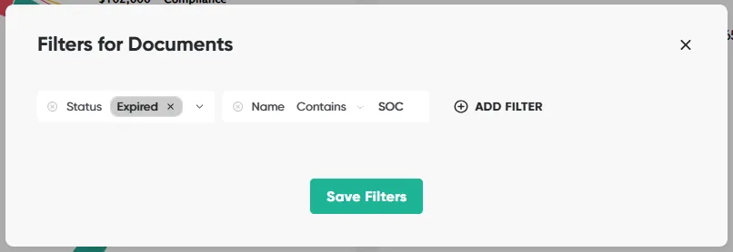
For example, filter a Documents table by:
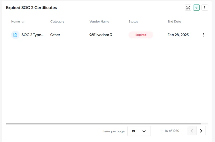
Rename the table and adjust the columns to only those relevant:
5.5.4 Understanding Available Charts
Spend (ERP required)
Spend charts only appear if your ERP (e.g., NetSuite or Workday) is connected. They visualize spend data captured in POs and requests.
-
Committed vs. Paid – compares planned spend vs. actual payments.
-
Approved Spend
-
Total – overall approved spend.
-
Monthly (by department) – approved spend trends by department.
-
Cumulative (by department) – running total of approved spend over time.
-
-
Actual Spend
-
Total (by vendor) – actual spend broken down by vendor.
-
Monthly (by vendor) – vendor spend trends over time.
-
Cumulative (by vendor) – running total of vendor spend.
-
Decision Time
Measures the speed of reviews and approvals.
-
Monthly, overall – average decision time across the organization.
-
Monthly, by department – breakdown of decision times by department.
-
Decisions made on time – % of approvals completed within their SLA.
Requests
Tracks request volume and outcomes.
-
By Department – number of requests created per department.
-
By Decision – requests categorized by status (approved, rejected, in progress).
Pipeline
Shows pending and future requests that may impact budget or capacity.
-
By Vendor – pipeline requests grouped by vendor.
-
By Request – detailed pipeline of open requests.
-
By Budget Line – requests mapped against budget lines (Budget Intelligence add-on).
-
By Department – pipeline broken down by department ownership.
👉 Without ERP integration, you’ll still have Requests, Pipeline, and Decision Time charts, but Spend charts will not be available.
Customizing Charts
Charts in Analytics can be tailored to highlight exactly the data you need:
- Rename – give charts descriptive names so their purpose is clear.
Filter by time range – adjust the data window to:
-
All time
-
Last: year, 3 months, 30 days, week
-
Next: year, 3 months, 30 days, week
-
Custom date range – pick specific start and end dates from the calendar
This site uses anonymous analytics to work out which pages are useful. Visits are not tied to anyone, and nothing you type is recorded. See the Opstream privacy policy.